
Lusha Chrome Extension Chrome extension redesign (UX,UI, redesign )
The Redesign Goals
1. Increase users use
2. To be updated with the new branding
3. Increase data presentation surface
4. Improve UX
5. Leading users to use Lusha's Platform (as the main product)
6. Encourage users to upgrade their plan
7. To be better data organized
The Research
I started with learning the users flow and interviewed a focus group that included a wide range of our extension users.
In addition, I understood their use according to their needs and their pains if there were any.
In this project I used qualitative and quantitative tests:
1. I Reviewed users sessions on 'FullStory'
2. I had 'One on one' Interviews with users.
3. I also Collected data from clicks and common flows.
In addition to that, I learned about our competitors and their product. Heard from our users in which cases they would switch to a different tool (competitors)
so we could better understand our weaknesses.
Research Findings - The Pains
These are the main pains I discovered, we decided to solve them as a first step of the redesign.
(while keeping in mind that we had new business goals that needed to go hand by hand with our 'user centered' design approach)
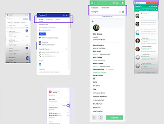
Before Revealing - Hidden
* Old design screenshots
After Revealing - Revealed
* Old design screenshots
The Illustration is not clear enough
and doesn't really contribute to understanding the contact job field.
(and it doesn't really match to all the kinds of job definitions)
The spacing is too big and takes a lot
of 'real estate' of the interface.
There is a lot of data with no hierarchy
and it demands a lot of scrolling on a small resolution screen. (Known as the most common in use)


The CTA's after revealing are not aligned with our business goals and doesn't match the layout.
The interface is not dynamic
enough to be customised
according to data amount.
Lusha's brand presence is missing,
the side window seems "floating".
Mood board and Visual Research


The Solution

The Extention Redesign

Main changes
1. Inside Header
I added an 'inside header' that would indicate the user that he's using a 'Lusha product'.
Clicking on the logo will lead to the platform, clicking on the settings button will lead
to the 'most common' general action (Log out, Credit use etc)

2. CTA's Hidden & Revealed
As part of our new business plan and according to user's most common questions,
the main CTA's (after revealing contact) where changed.

Hidden
Revealed
3. Dynamic General Data Components
A solution that presents the main general company data in a form of dynamic components with
a layout that helps saving space and minimizes scrolling actions while at the same time can be customised according to the changing collected data for each company.

New Sort & Filter Components Improving common actions
As the main goal of the redesign was to find a solution for presenting the user a wide range of Lusha's data that keeps growing every day. We continued with the user interviews and it came up that there were. some actions that were not clear enough. We searched for a UX solution in order to simplify the user experience so we could help them in getting the most out of their search.
New UX

Old UX

New UX Dynamic Component States


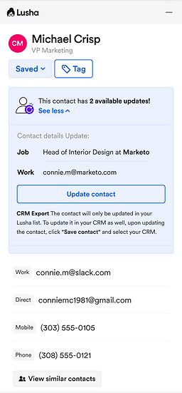
Refresh Data Adding new abilities requires new solutions
As Lusha keeps refreshing its data, for the users it gets more complicated following these changes once revealing a specific contact. We needed to find a way
that would inform the user about the updated data that now Lusha has. This new feature, will help the user know that he can now get more/different data
of a revealed contact.
Alerting Component_Closed

Alerting Component_2 Updates
Alerting Component_2 Updates & Added Details
